Analysis Paralysis plaguing SKILLZ Members
Through contextual research, user interviews, and user testing I was able to uncover challenges new members were facing and frustrations existing members were experiencing. By reimagining the user flow that met the users' needs we increased the company's stick rate & LTV while decreasing a user's time on task allowing them to spend more time "on the mat".
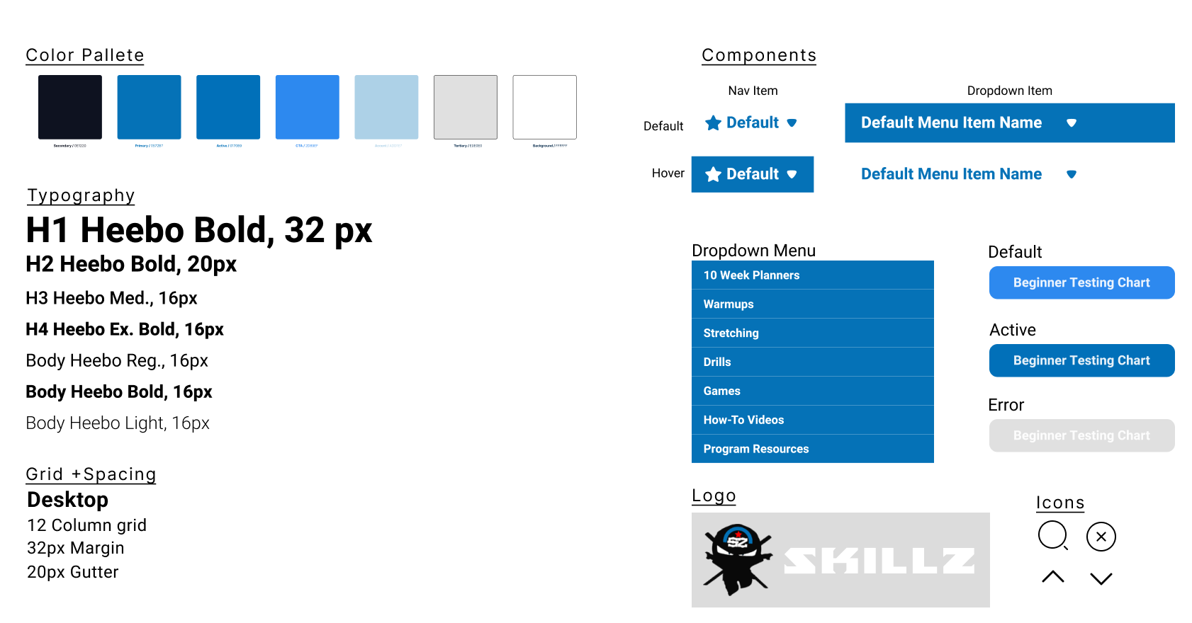
Elevate Experience & Drive Value
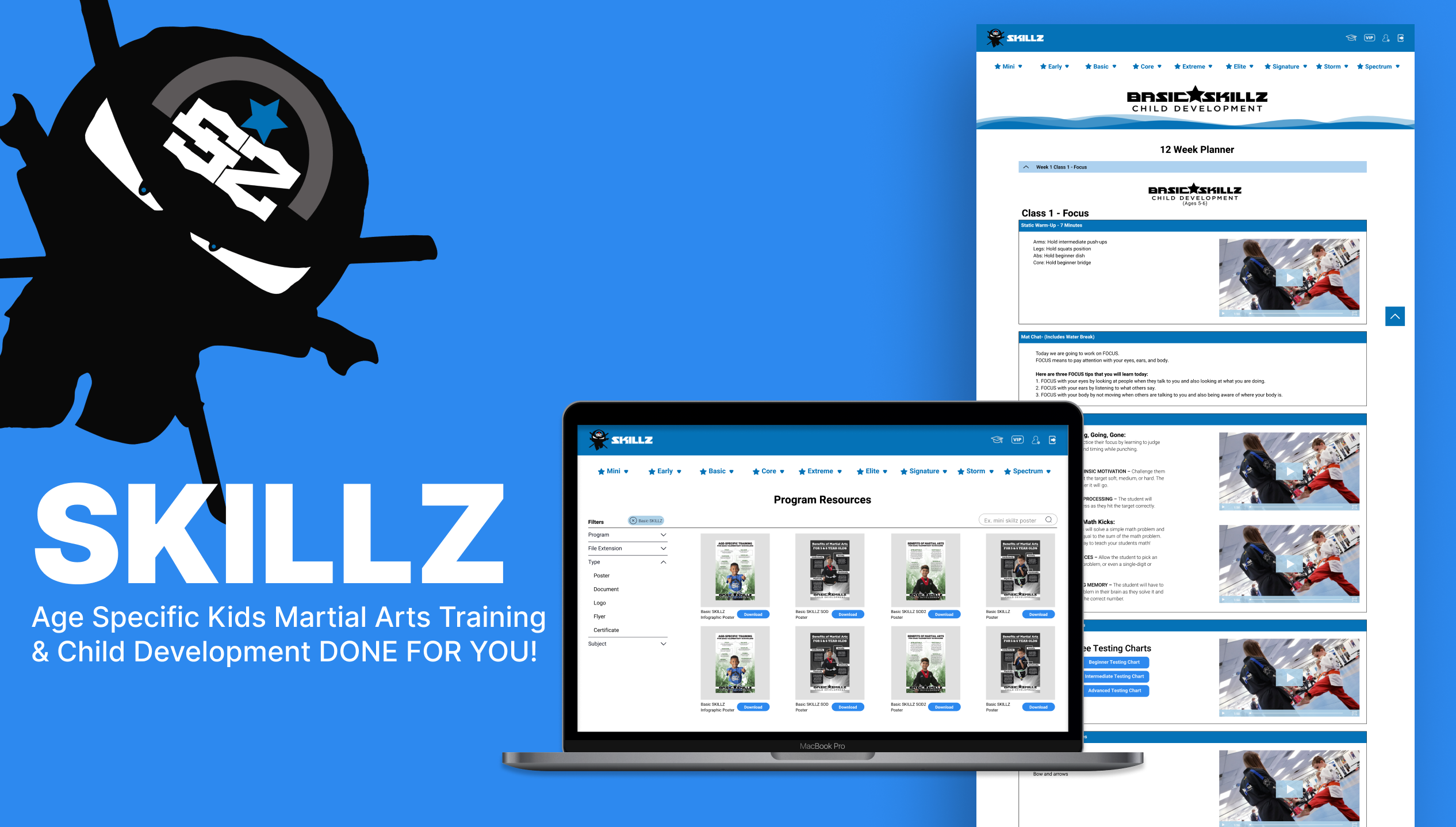
Revamping a vast online curriculum platform with thousands of pages, our goal was to create familiarity, alleviate pain points, and boost customer lifetime value (LTV) and monthly recurring revenue (MRR) through strategic design choices.
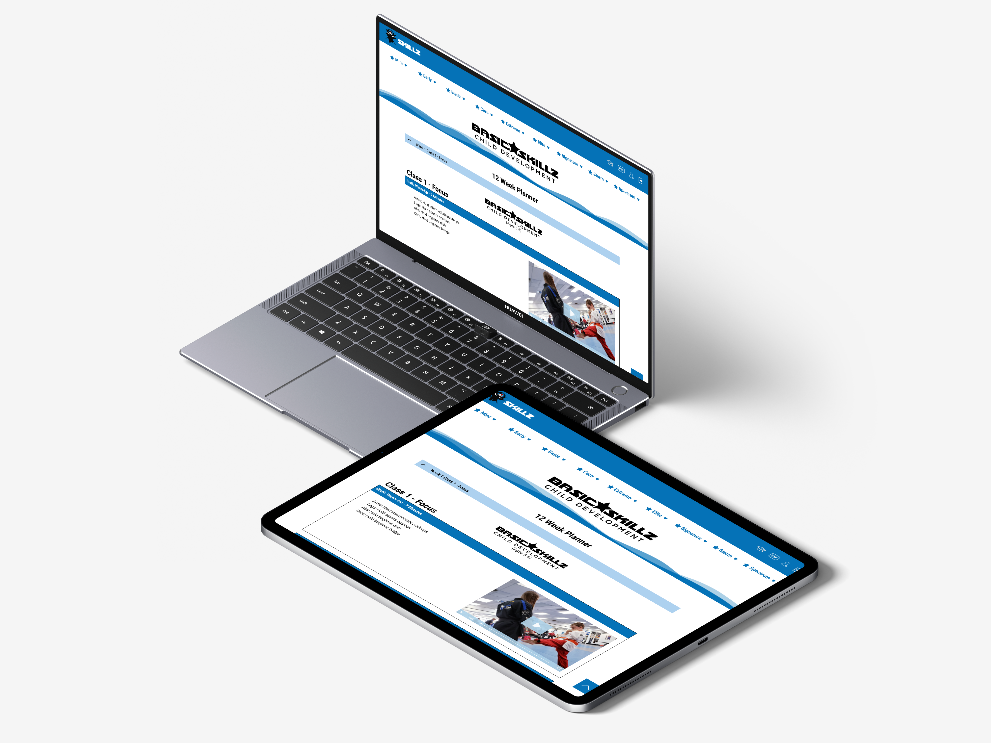
Seamless On-Brand Redesign
Our objective was to deliver a redesign that seamlessly incorporated an on-brand design system, ensuring a user journey that struck a balance between familiarity and efficiency, expediting users to their destinations with greater ease and satisfaction.
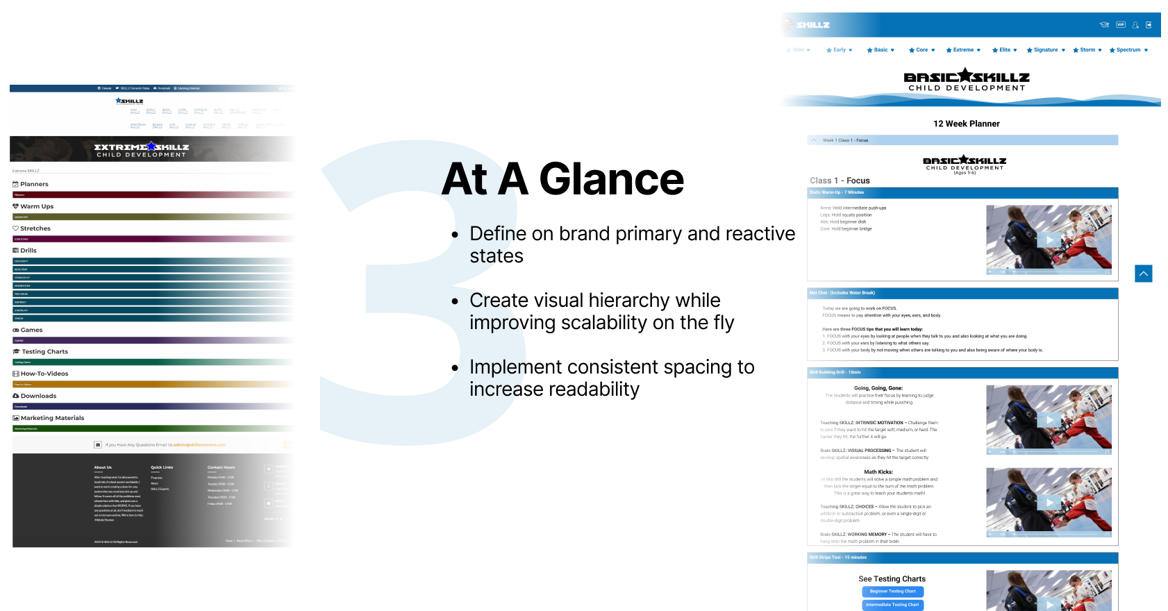
Streamline User Experience
Usability testing confirmed the media asset redesign's success, delivering a highly intuitive website that reduces cognitive load. New member onboarding is friendlier, reducing stress when incorporating SKILLZ systems.
01 /
Chapter
THE RESEARCH
// Key Observations
Asking the right questions
Research Goals
I first started by gathering important KPI data points such as content views, page views, heat maps, downloads, and engagement etc. to begin to inform the questions we would ask during our user interviews and find out what is frustrating users plus what we can do better!

User Interviews
User Interviews were conducted targeting members who have been with the company for 3+ years, >1 year, and newly registered members to discover if there were any underlying challenges shared across the lifetime of a member.

User Data
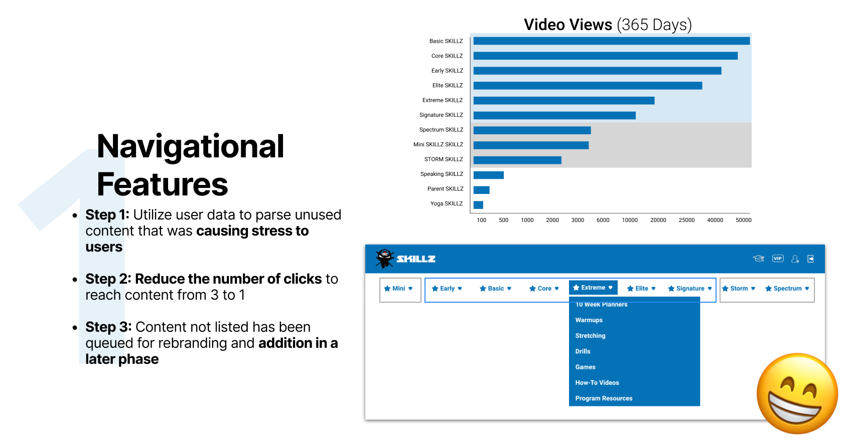
The KPI I used to determine which content users were consuming the most were Video Views, Page Views and file downloads. I also utilized Hot Jar to gather more data on how users were interacting with our CTA’s and Menus.

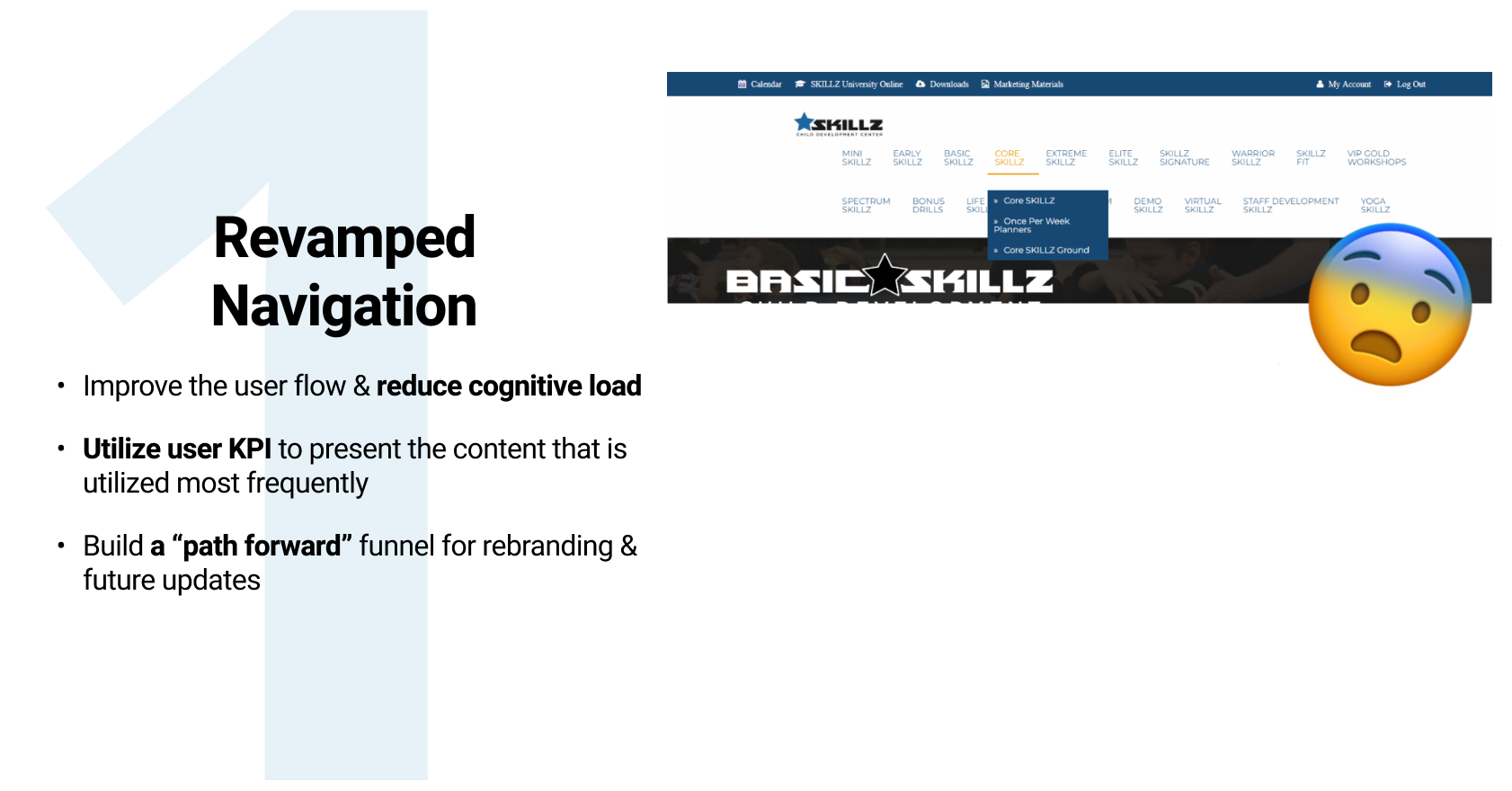
Information Architecture
Because the company has been producing content for years, the quantity of information can be intimidating when starting out. It was clear we needed to figure out what users were interacting with, and map out a way to help them get there more intuitively.
Main Insights
It was important to let the data and user preferences drive my design decisions. After processing all the data I was able to synthesize may valuable insights into how the users are wanting to interact with the site AND what blockers are currently in their way when they attempt to accomplish a task.
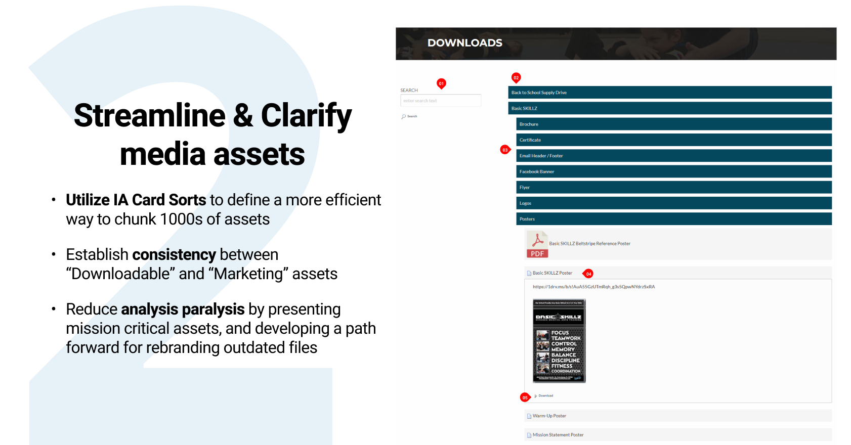
Users report resorting to Facebook to ask for help when searching for specific downloads.
Users lose trust in the site when sent to OndDrive to download media files and documents.
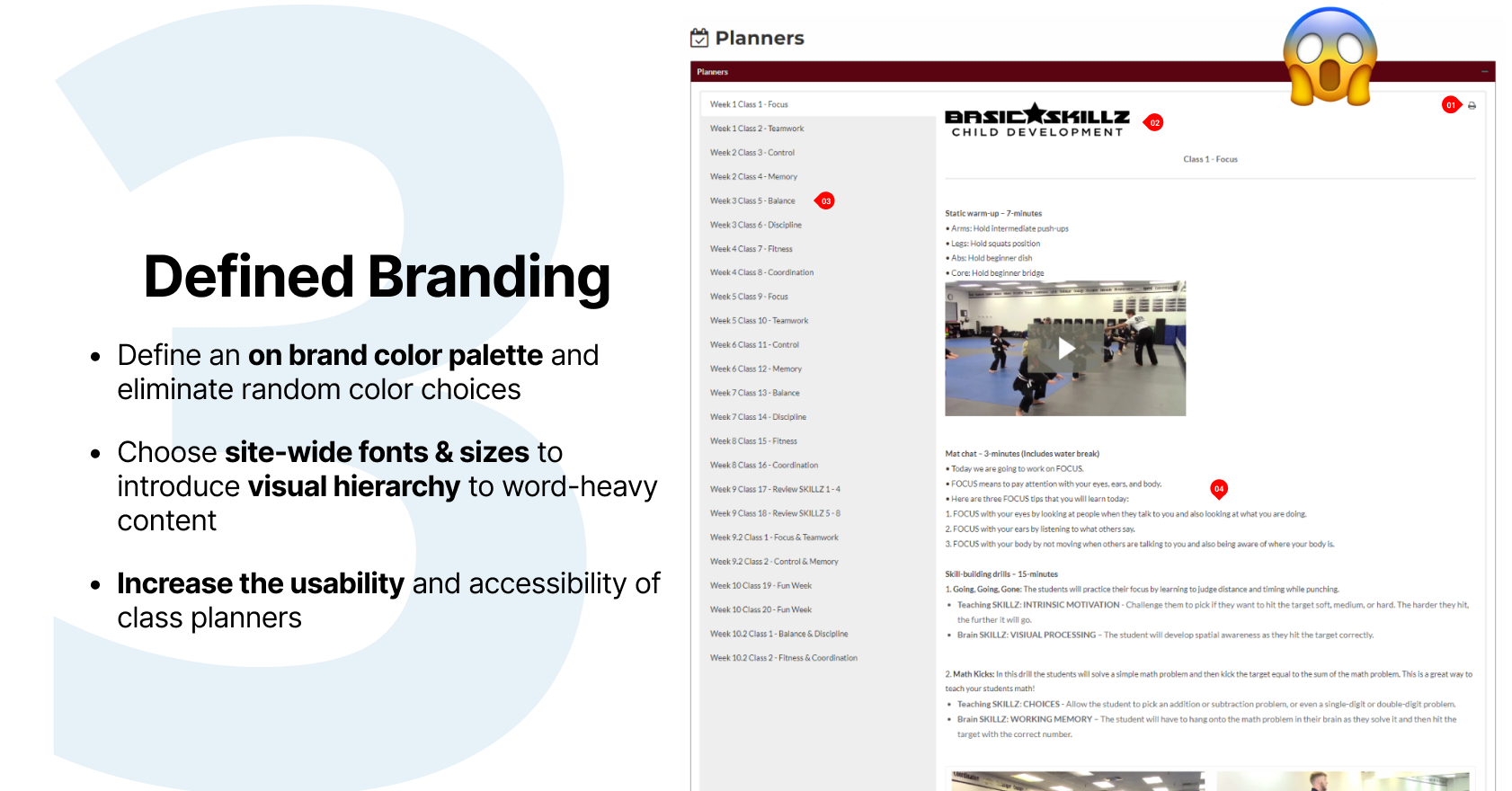
The class planners are used on a daily basis and usually just prior to class. They are hard to read quickly.
70% of interviewees mentioned having difficulty finding downloadable media assets.
90% of users access the site via desktop which is opposite of my original hypothesis that users preferred mobile devices.
Most users spend less than 5 minutes on the site. Designing with scalability in mind will be highly valuable.
Define our Focus
Facilitating existing behavior and giving users what they came for
Through this research we identified multiple areas of concern, such as overwhelming navigation, lack of structured hierarchy, and a branding disconnect. Facing a complete UI (User Interface) redesign, we decided to prioritize feature updates based on KPI and importance.
Moving forwards, our goal was to create a design that felt familiar and on-brand, but NEW and efficient.
Moving forwards, our goal was to create a design that felt familiar and on-brand, but NEW and efficient.
"I love all the information but I get lost sometimes and tend to give up"

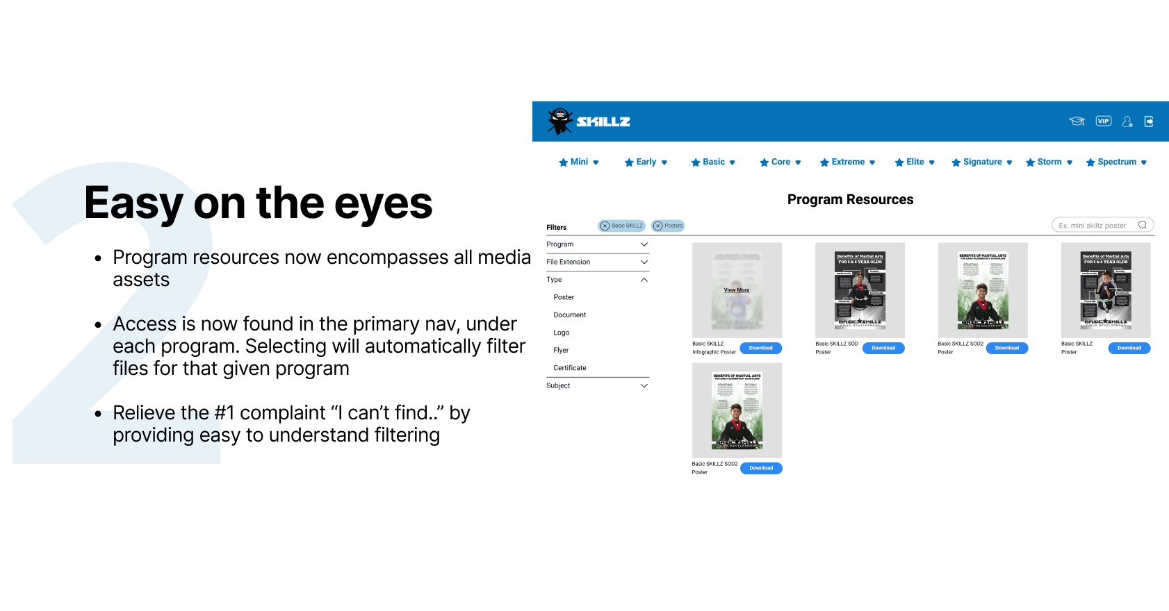
"I wish I could find all the downloads in a single place"
"Once I log in, I have no clue what to do next"
02 /
Chapter
THE SOLUTION
// Data Synthesis
Getting clear on the goals
03 /
Chapter
THE EXECUTION
// Design Prioritization
Research driven design goals
04 /
Chapter
THE DESIGN
// High Fidelity Designs
Finalizing visual designs
Link to Figma file Here
// key findings
Measuring success
As project manager on this redesign, I had the privelige of working as the UI/UX lead and be a liason with the SKILLZ front end developers. Together we were able to work together and create solutions that were designed well and still within the technical constraints presented by the developers.
MVP vs. Perfection
Stakeholders were adamant about getting an MVP to market as fast as possible to capitalize on industry trends. While we were working with solid deadlines I am glad I was able to provide solutions that were thoughtful, informed, and exceeded stakeholder expectations!
Room for Growth
SKILLZ is a living and evolving online curriculum therefore the next step will be developing a Mega Menu that maintains clear communication without seeming bulky and difficult to manage.
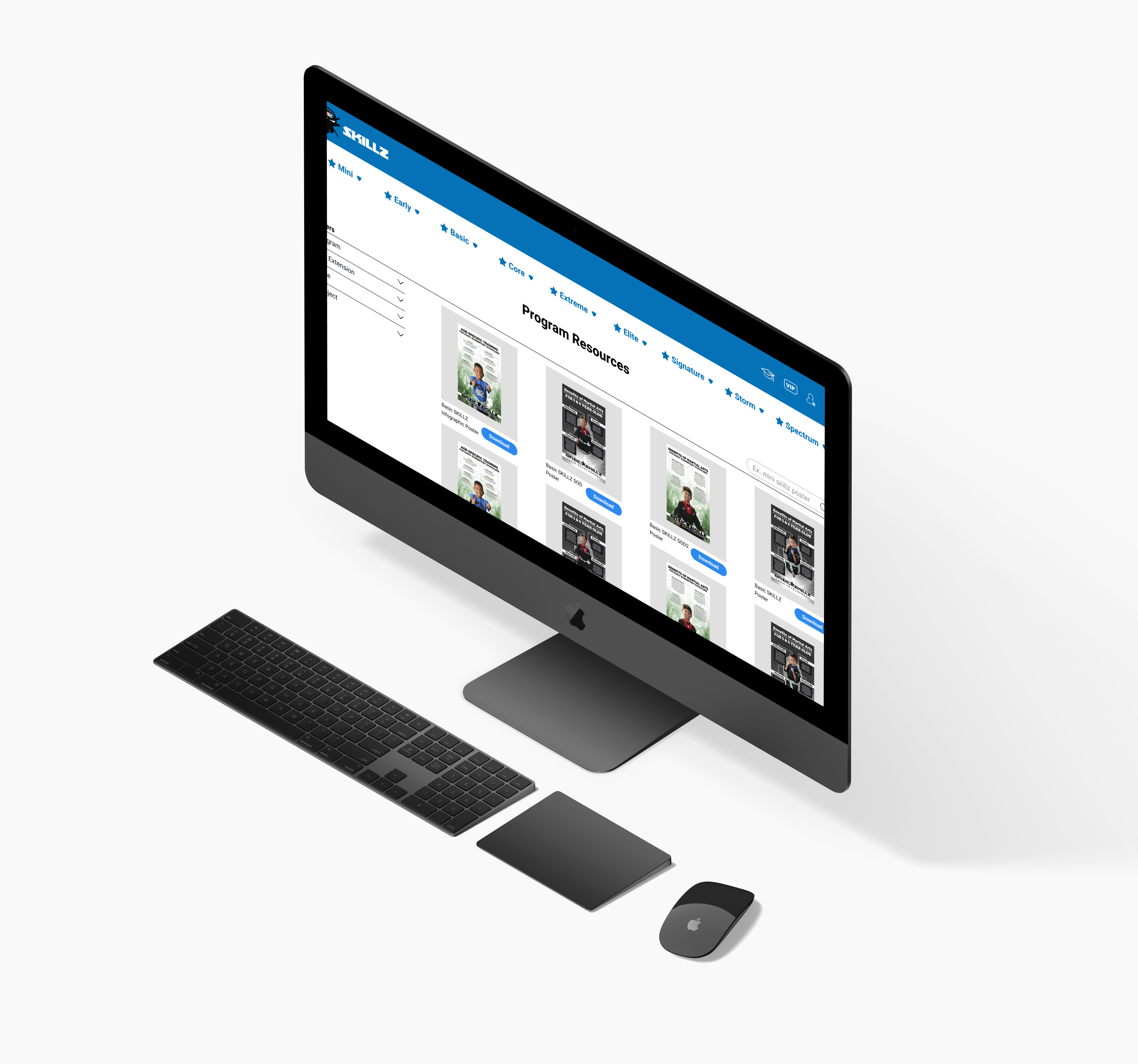
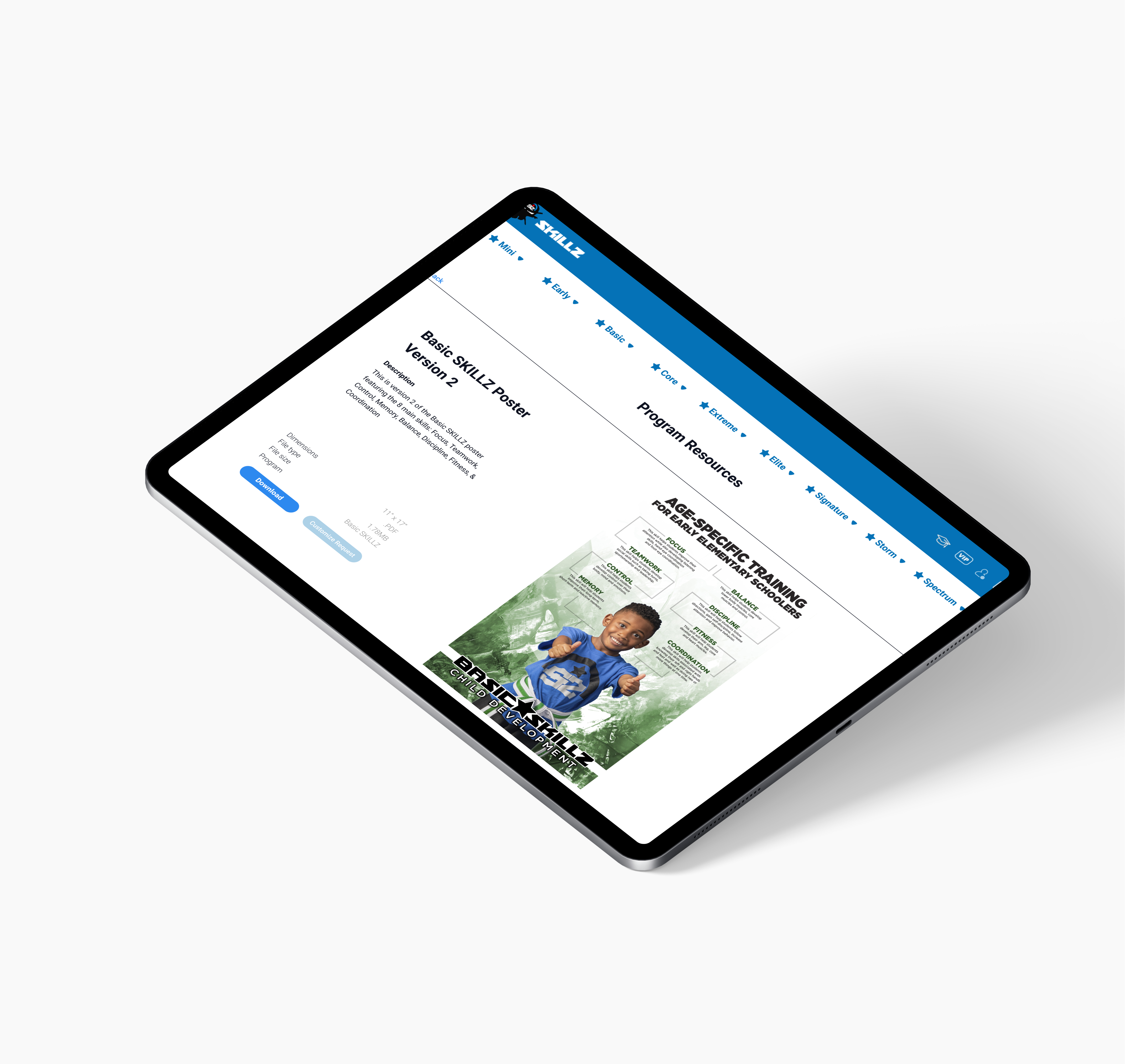
User Feedback
Initial usability tests of the newly designed Program Resources pages were extremely positive! I'd love to give users more time to get hands on, then conduct more interviews in order to see how I can further imporve the design.
Multi-Phase Project
Because so much of the content needed to be rebranded OR recieved little to no meaningful engagement; I was able to work with stakeholders to develop a rebranding plan and future update funnel!