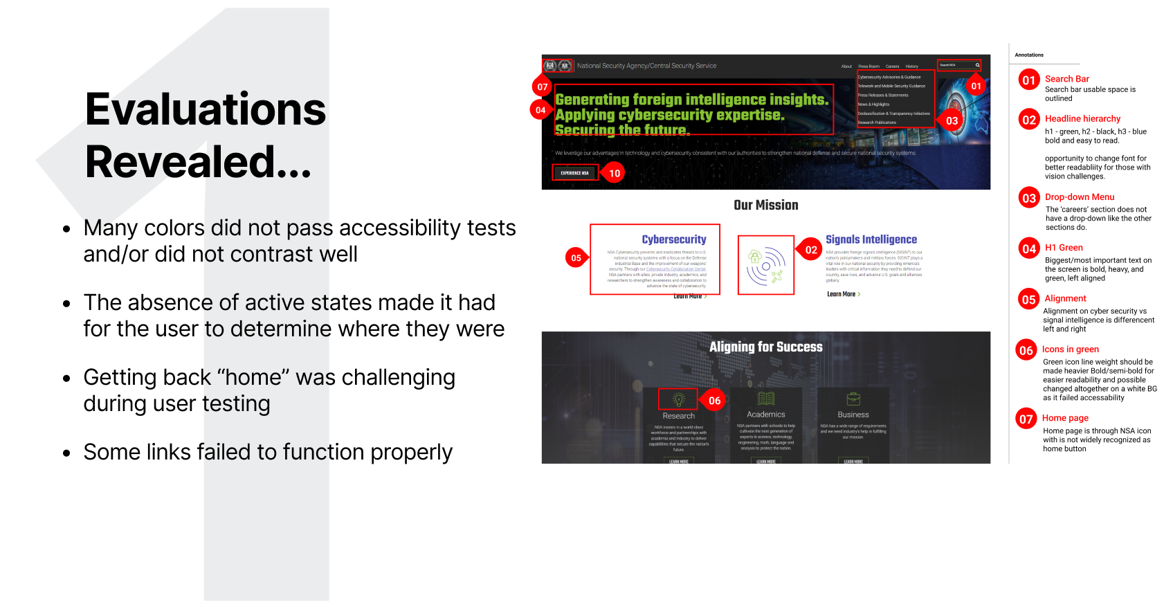
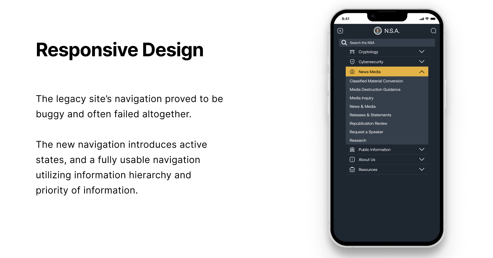
Navigation is inconsistent and confusing
When tasked with the challenge of finding a specific piece of information, users are often frustrated by the architecture and unclear user path resulting in utilizing alternatives such as Google. Additionally, navigation elements begin to break or become difficult to use at smaller screen sizes making the tablet and/or mobile experience unpleasant at best. Many assets also failed to meet accessibility standards.
Simplifying Information Access
When undertaking the redesign of the National Security Administration website, our primary obstacle lay in deciphering and presenting a vast array of information in a manner that enhanced user comprehension and facilitated efficient information retrieval, ultimately empowering users to navigate with ease and effectiveness.
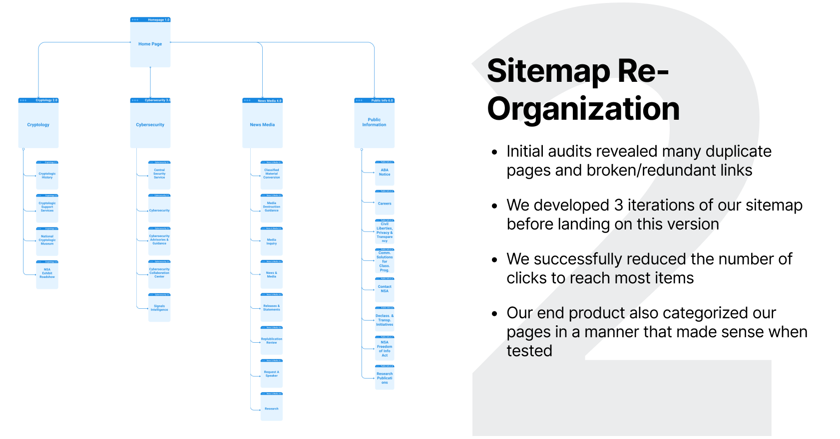
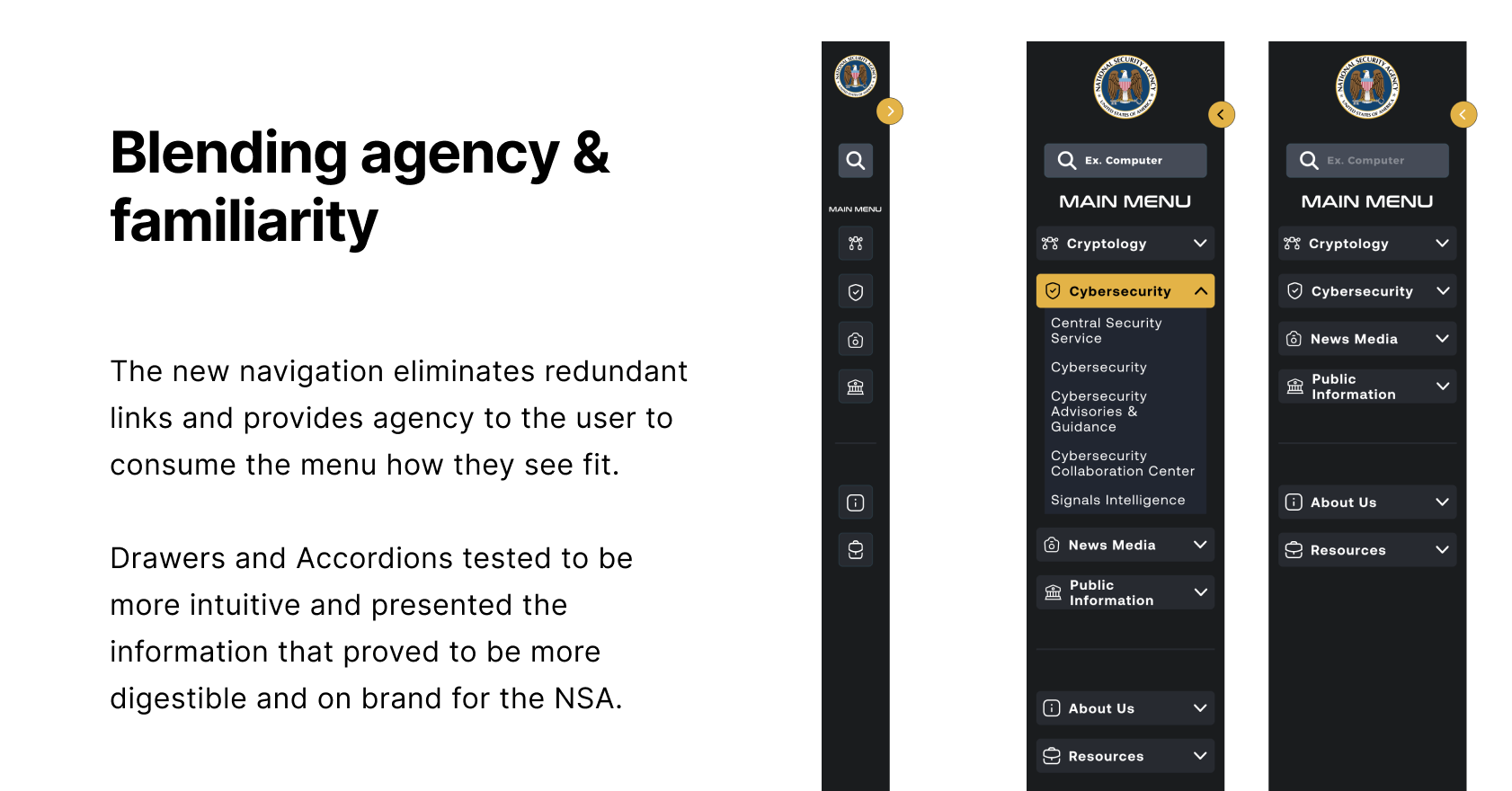
Intuitive Information Organization
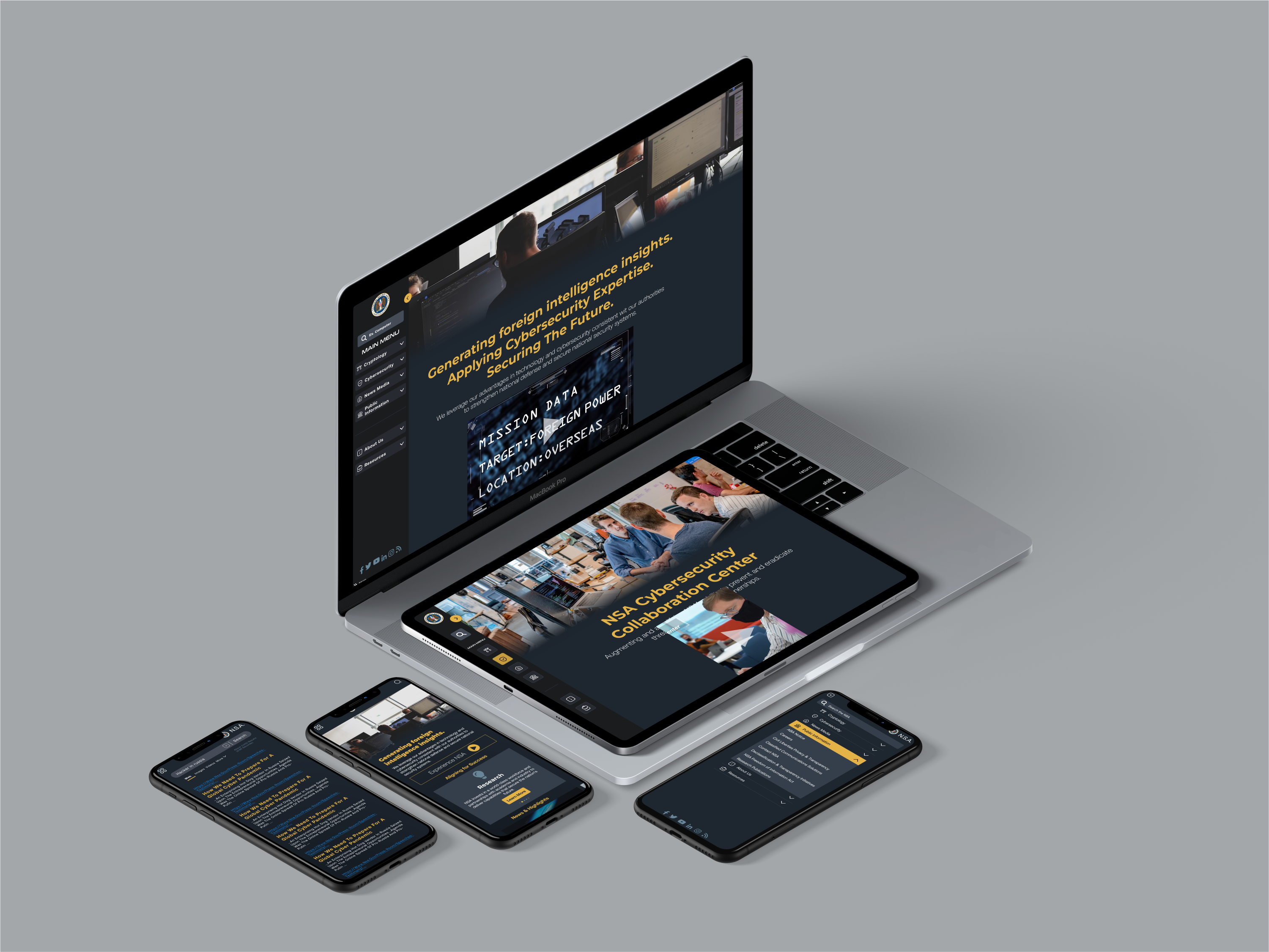
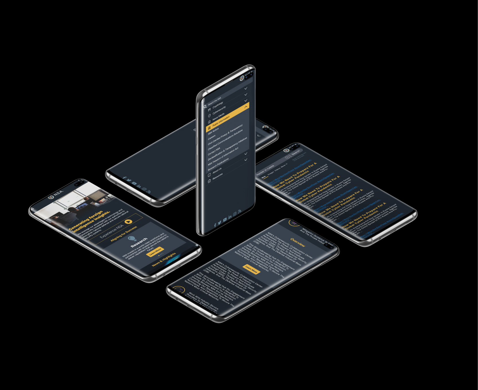
Our objective was to offer users an enhanced and familiar user journey by strategically organizing pertinent information into intuitive sections, promoting effortless navigation and ensuring a seamless user experience.
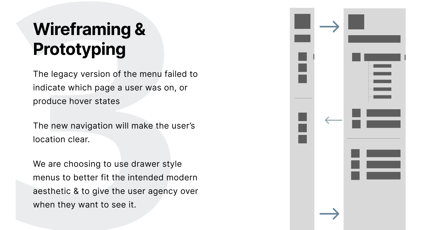
Drawer-Style Menu Delights
Through user testing, we discovered that the implementation of a drawer-style menu resulted in a significantly enhanced user experience, fostering enjoyment and providing a clearer user journey towards accomplishing tasks.
01 /
Chapter
THE RESEARCH
// Key Observations
The site offered mostly information, specifically media & press-related documentation.
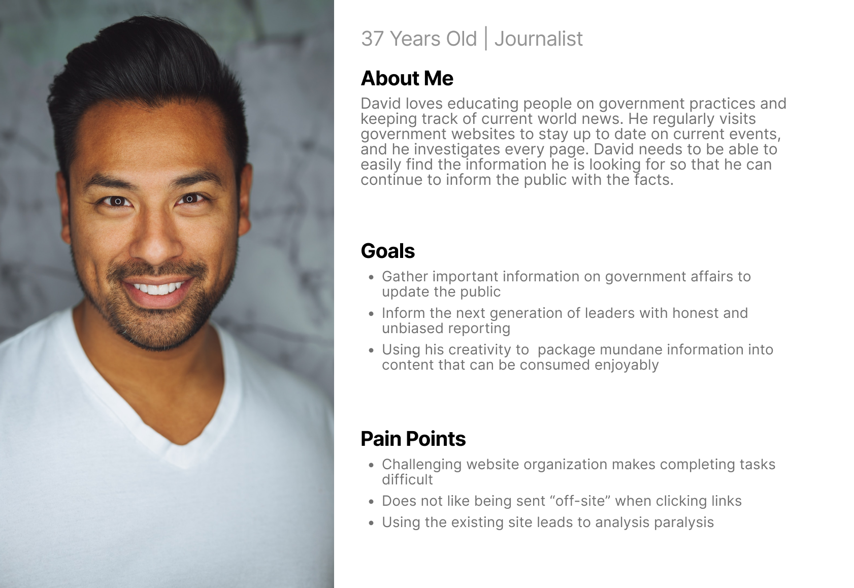
Meet David!
Our persona was designed to reflect a typical user that would take advantage of this information.
Usability Testing
We conducted usability testing in person to evaluate: Ease of Navigation, Button CTA & Placement, and the Intuitive User Journey.
38%
of feedback revealed confusing or misleading buttons
25%
of feedback defined accessibility challenges
19%
of feedback was related to navigational challenges
16%
of feedback indicated links were unclear or overlookd
Define our Focus
Based on our user insights we synthesized and prioritized various features to aid in our goal to increase usability site-wide

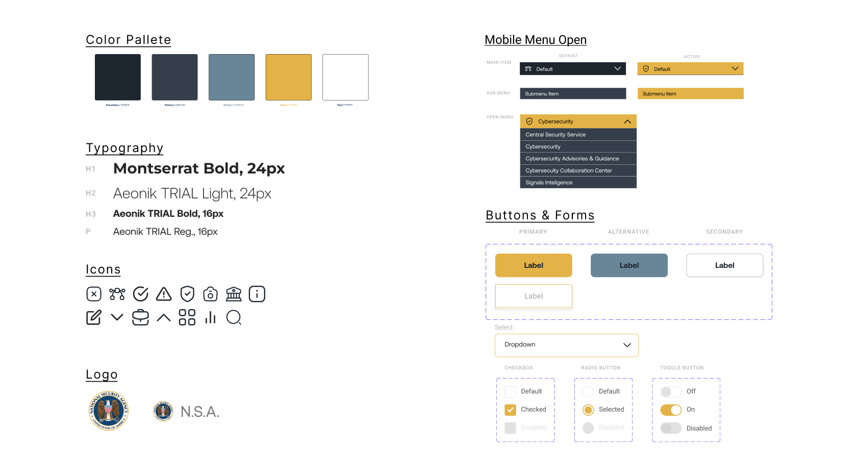
Redefine UI Elements
Clear and Concise Homepage
Clear Search CTA
Improved Color Accessibility
Congruent Button CTA
Improved Navigation
Clear Search CTA
Improved Color Accessibility
Congruent Button CTA
Improved Navigation

Optimize & Enhance
Remove Duplicate Buttons
Consistent Button Styling
Improve Text Readability
Consistent Button Styling
Improve Text Readability

Enhanced User Journey
Improve Link Recognition
Fold-Focused Information
Reduce Scrolling
Reduce Clicks to Goal
Fold-Focused Information
Reduce Scrolling
Reduce Clicks to Goal
02 /
Chapter
THE SOLUTION
// Data Synthesis
3 Major Design Aspects
03 /
Chapter
THE EXECUTION
// Design Prioritization
Creating clarity & ease of use is key
04 /
Chapter
THE DESIGN
// High Fidelity Designs
Finalizing visual designs

Link to Figma file Here
// key findings
Looking back...
I would love to begin to track KPI and website analytics to gather more data and further iterate on navigational and heuristic aspects of their website.
Further usability testing
Continuing usability testing to uncover valuable insights for delivering an enhanced and holistic user experience at every touchpoint.
Data-Driven Optimization
Leverage Hotjar or equivalent software to visually analyze user interactions, search queries, page visits, alongside page views and bounce rates, to inform a data-driven reorganization strategy and prioritize user-centric design decisions.
Enhanced Engagement
Through continuous iteration, we will focus on enhancing the layout to effectively showcase videos and links, ensuring optimal visibility and accessibility. This deliberate approach aims to amplify user engagement and create a seamless browsing experience that aligns with user expectations and preferences.
Optimizing User Experience
In the future, we will implement A/B testing to evaluate various design variations, allowing us to gather empirical data and make informed decisions about the most effective user experience enhancements. This iterative approach will enable us to continuously optimize the website based on user feedback and data-driven insights.