Lack of clarity leads to frustrated users
We have discovered that users are frustrated with the readability & the unintuitive user flow which is causing them to exit the site without contributing or fully educating themselves. This sparked the questions: What is the site’s purpose? -And- How can we help the user succeed?
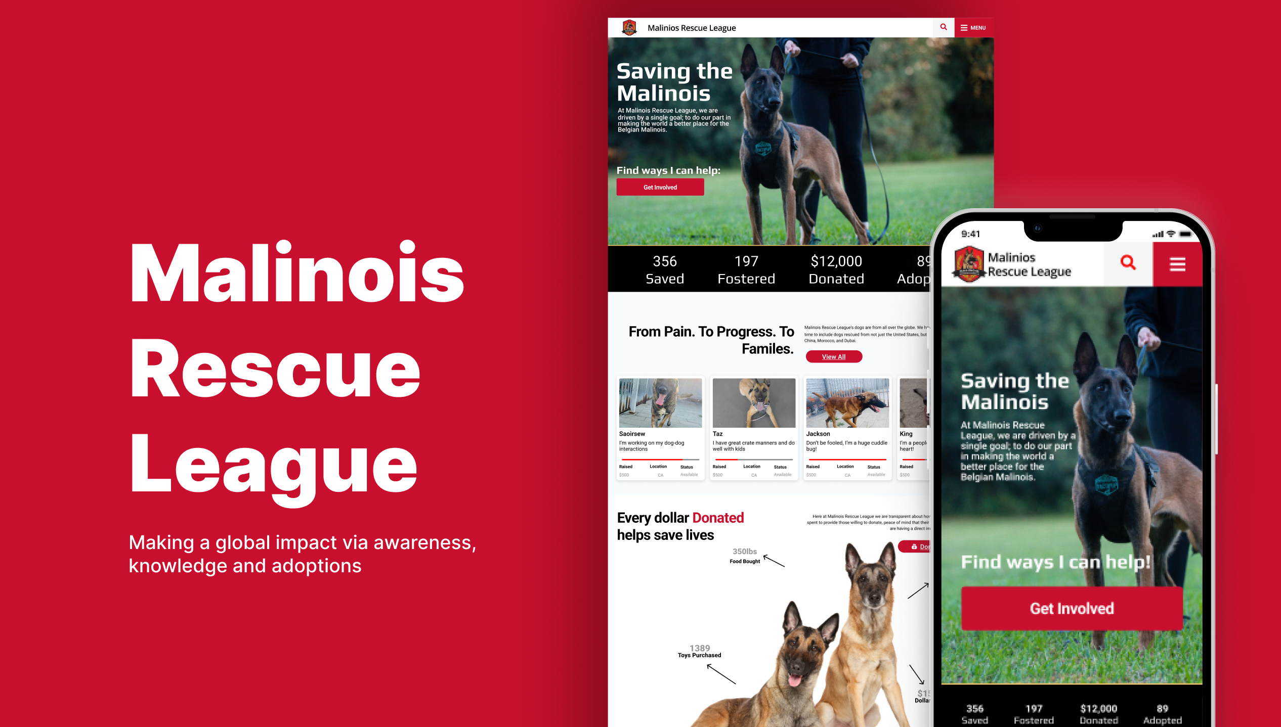
Bridging Goals through Design Excellence
Our objective encompassed crafting an aesthetically pleasing and seamlessly functional design, deliberately guiding users towards their desired destinations with intuitive clarity, ensuring a seamless accomplishment of their tasks.
To create clarity & ease of use
Crafting a seamless customer journey and intuitive functionality are the focal points of the non-profit website redesign, ensuring a clear and effortless user experience.
User-Centric Redesign Shines Bright
Usability testing following the redesign validated our findings, affirming that users were able to complete tasks with increased speed, confidence, and reduced anxiety, emphasizing the positive impact of the redesign on user experience.
01 /
Chapter
THE RESEARCH
// Key Observations
Users were ready to take action, but...
Research Goals
Through user interviews and surveys, the research seeks to gain insights into users' priorities and preferred actions, particularly in donating and adopting, in order to inform design decisions and optimize the user journey.

Donation Transparency
Every interviewee was willing to donate in some form BUT they had strong reservations after being burned in the past. They expressed that they need to know where the donations are going, and how past donations have been spent.
Uncovering Preferences
We conducted in-person user interviews along with google surveys to help better understand the needs of our users. Gaining insight into our users will help educate us on which actions are most important to them and inform us as to which actions they are most likely wanting to take.

Action Focused
With 55% of users willing to donate and 45% willing to adopt it became apparent that Donating and Adopting were going to be the top actions users take when visiting the page. Therefore, we needed to pay close attention to the design and eliminate as many blockers as possible that may prevent the user from completing their task.
Main Insights
Here are a few key findings from the research highlighting important aspects that impact user behavior and preferences. These insights encompass user concerns about donation transparency, a preference for donating tangible items, the importance of financial transparency for increased donations, issues with the adoption process and application experience, and the significance of providing clear information about adoptable dogs.
Many users have been burned or have heard of someone being taken advantage of when donating money.
Users often feel more confident donating toys, food, or supplies in lieu of money.
Users are willing to donate more when there is financial transparency around fiscal allocation and supply distribution.
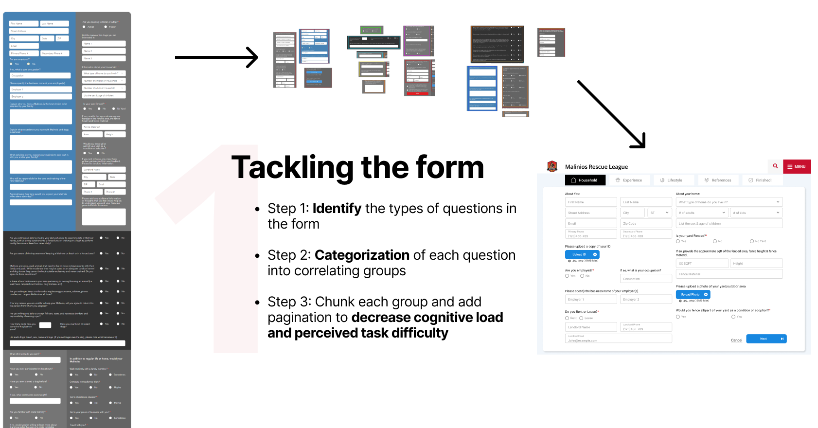
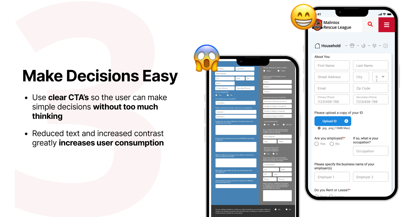
The current adoption process and requirements require the user to visit multiple pages in order to get a full understanding of the process.
The application looks intimidating which drives users away without fully completing the form. It also functions poorly on mobile.
Having a clear understanding of a potential adoptable dog is very important for the user.
Define our Focus
Streamlining User Experience: Prioritizing Impactful Improvements
Based on our Heuristic Annotations, User Research, and Testing Feedback we were able to identify many areas needing improvement. But with a limited timeframe we needed to prioritize features that would have the biggest impact in making tasks easier and more enjoyable for the user.

"I'm not quite sure what I'm supposed to do on this website"

"I am most likely to support through food or monetary donations"
"Wow, I'd be interested in adopting, but the form and process seem intimidating"
02 /
Chapter
THE SOLUTION
// Data Synthesis
3 Major Design Aspects
03 /
Chapter
THE EXECUTION
// Design Prioritization
Creating clarity & ease of use is key
04 /
Chapter
THE DESIGN
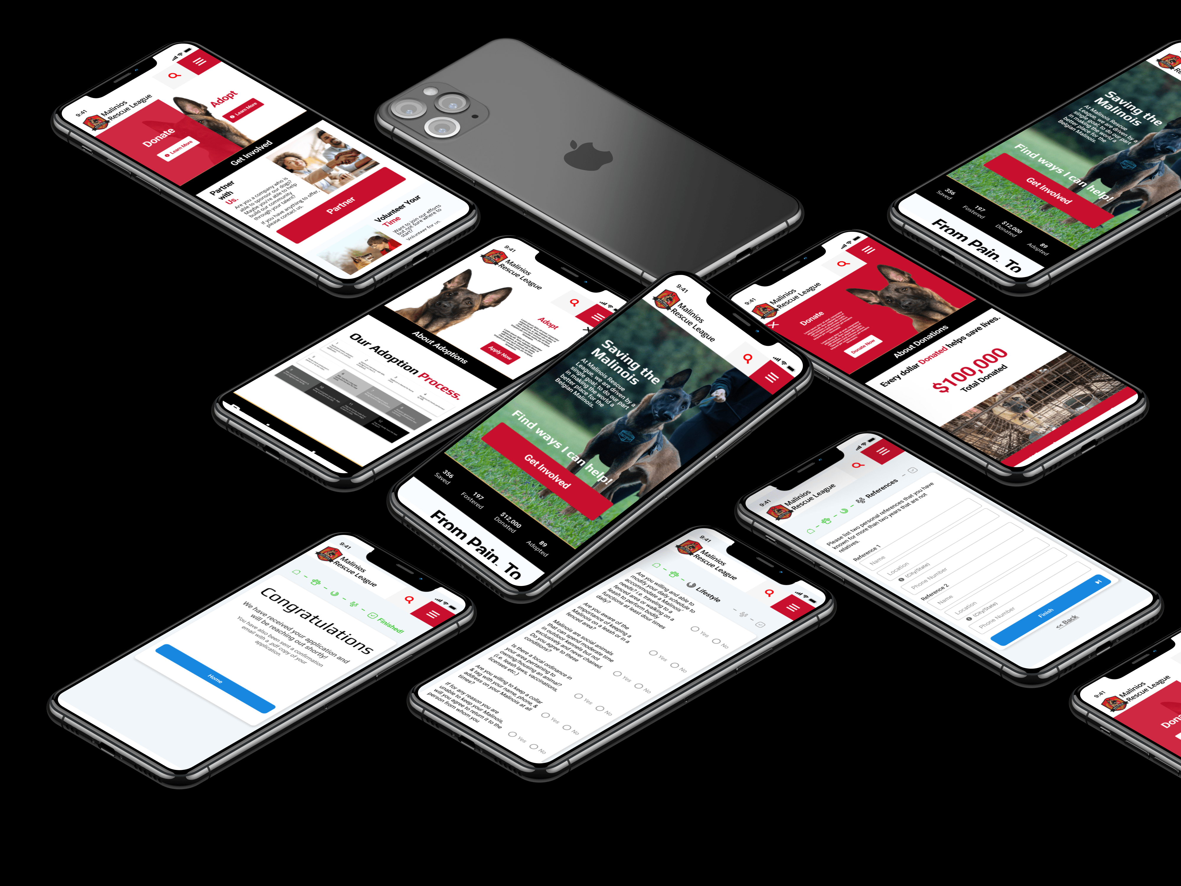
// High Fidelity Designs
Finalizing visual designs
Link to Figma file Here
// key findings
Looking back...
This was a great project that allowed me to exercise many of my UX and UI skills. However I was also able to walk away with many valuable insights that will carry over into every future project.
Intentional Spacing
In the beginning stages things were placed according to the principle of proximity but it became apparent that more needed to be done. We quickly decided that all vertical spacings needed to be a multiple of eight (i.e. 8px, 16px, 24px, 32px etc.) and we quickly developed a spacing rubric that could easily be carried across from page to page.
Form and Focus
At first I was intimidated by the form (just think about how the user must feel) but soon realized that this challenge would be incredibly valuable once completed. I went back to step 1 of my design process and approached it one step at a time until I was able to iterate on something that was usable and non-threatening.
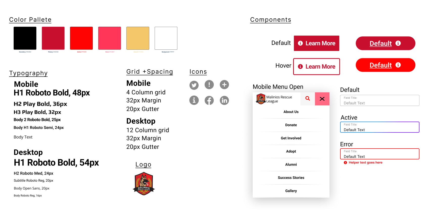
Thoughtful Components
A button is not just a button. We needed to design a button (and other components) that were future proof. Meaning we built in left and right icons, states, booleans, and text fields so that future designers can easily adapt the design if needed.
Informed Design
There were countless times where I wondered “How can I make this better?” Then I realized the real questions I should be asking are: “What purpose does this serve?” -> “Does it accomplish the purpose well?” -> “Is there a better way to accomplish the purpose?”